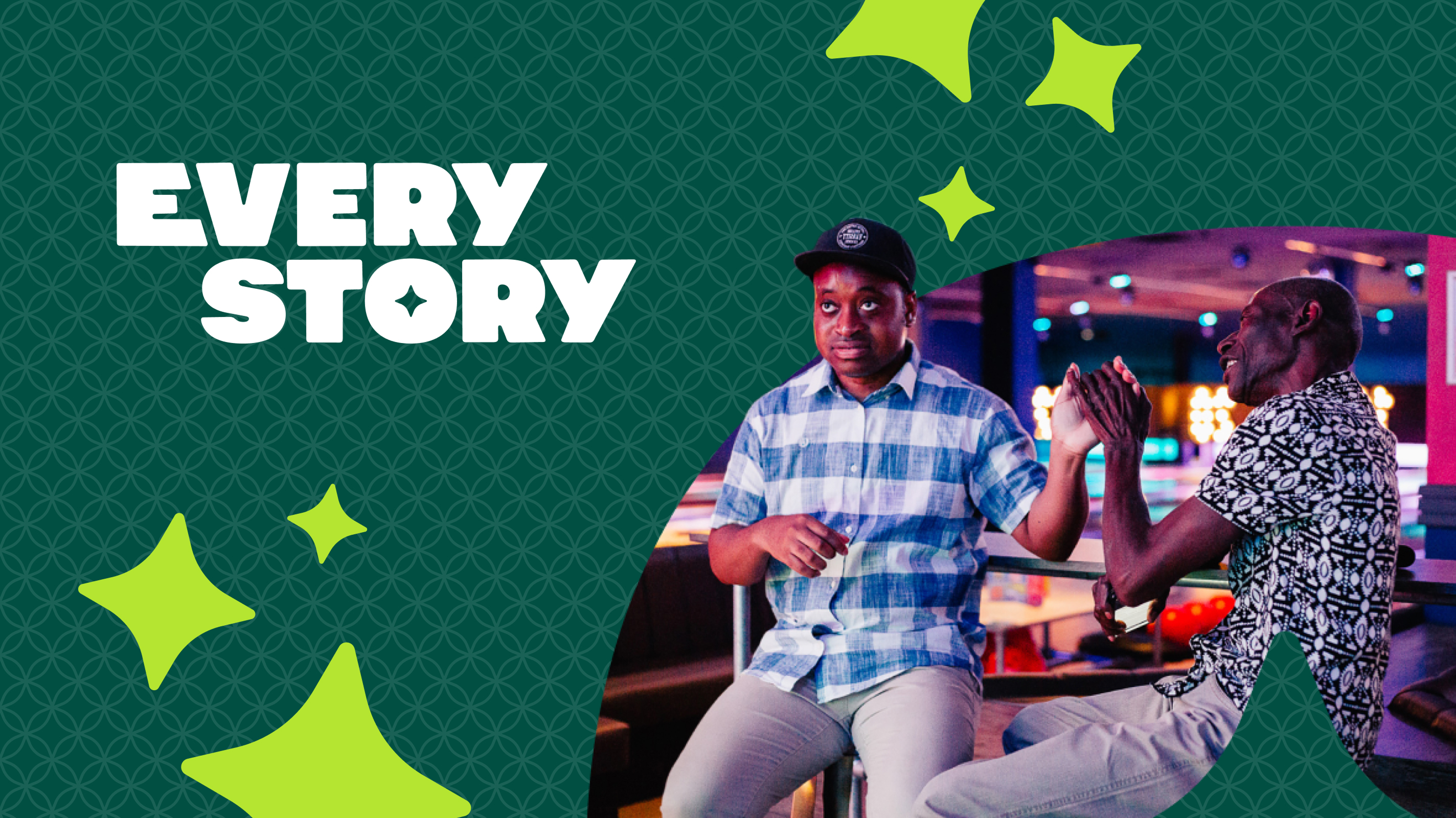
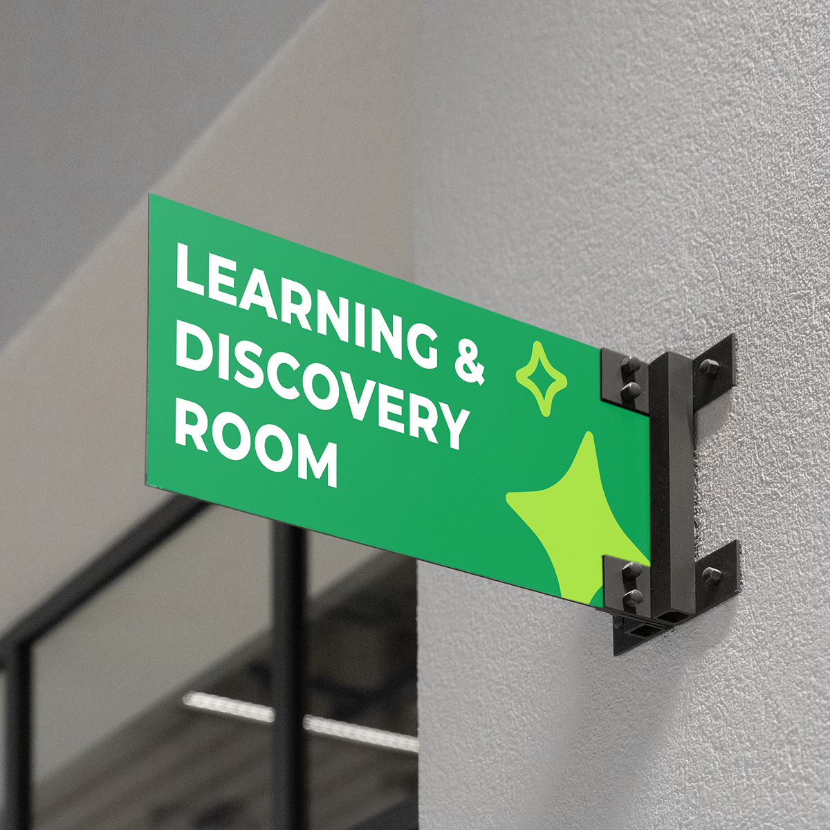
EveryStory is a South East London-based charity supporting people with learning disabilities and autism to live as confidently and independently as possible. We partnered with them to redefine who they are, what they stand for, and how they show up in the world. Together, we built a brand rooted in individuality, ambition, and belonging.
THE BACKSTORY
EveryStory began as two respected organisations, Lewisham Nexus and Aurora Options, coming together with a shared commitment to champion independence and inclusion. However, three years after the merger, the charity was still operating as two entities in practice. Staff felt disconnected. The community lacked clarity. And without a unified identity, the charity struggled to tell its story with confidence.
The existing name, Aurora Nexus, was a fusion of the two original brands. It did not reflect the charity’s purpose or the people it exists for. The organisation was ready for a bold new chapter, one that celebrated individual lives rather than legacy structures.
THE PROBLEM
The merger had created structural unity, but not emotional unity.
- Two teams still operating separately
- No shared brand purpose, vision, or voice
- A name that did not communicate what the charity does
- A visual identity lacking energy and recognition
- Limited visibility across local communities and funders
Internally, there was no clear narrative to rally behind. Externally, this meant missed opportunities to build awareness, attract funding, and empower more people with learning disabilities to thrive.
The charity needed more than a rebrand. It needed a reset.
THE SOLUTION
We developed a brand strategy that put personality before disability. The brand champions bold thinking, embraces thoughtful risk, and celebrates every unique journey.
Strategy
We defined a purpose built around creativity, empowerment, and fearless advocacy. Driven by the belief that every person deserves a life of opportunity and belonging, this new direction positioned the organisation as innovators in social care, ready to challenge expectations and build richer lives through courageous support.
Naming
Through collaborative workshops, one insight stood out: every person has their own story. That idea became the foundation of their new name, EveryStory, a name that honours individuality, captures possibility, and invites people to shape their own future.
Identity
We created a brand world full of energy, pride, and optimism.
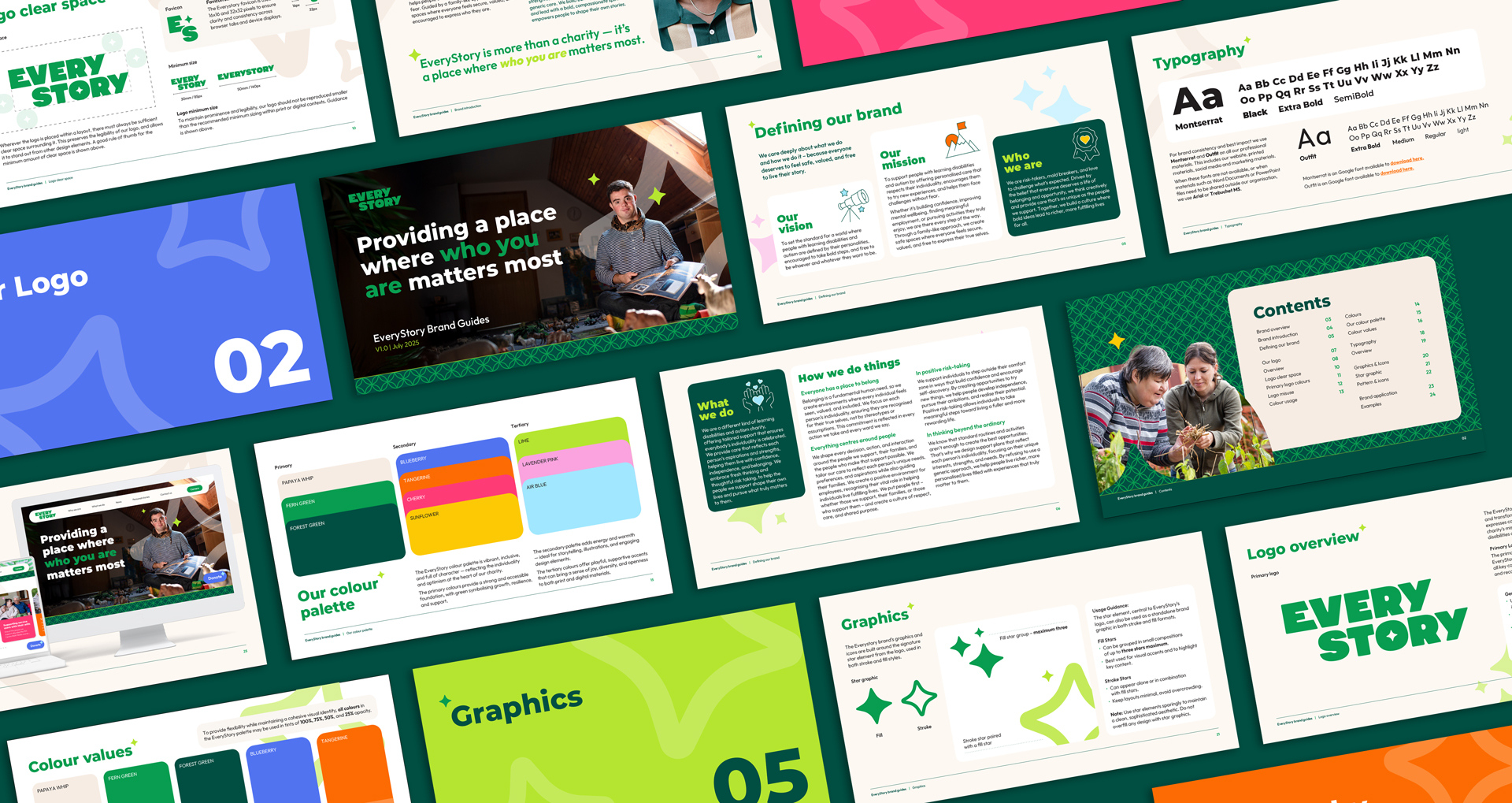
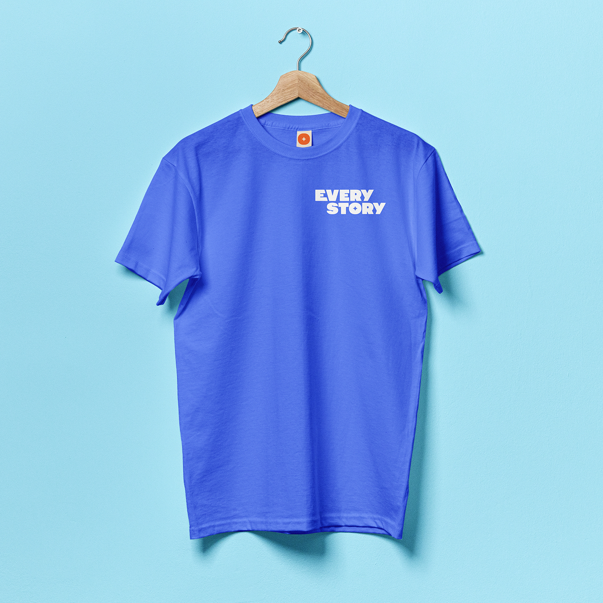
- Bold custom typography that reflects confidence and individuality
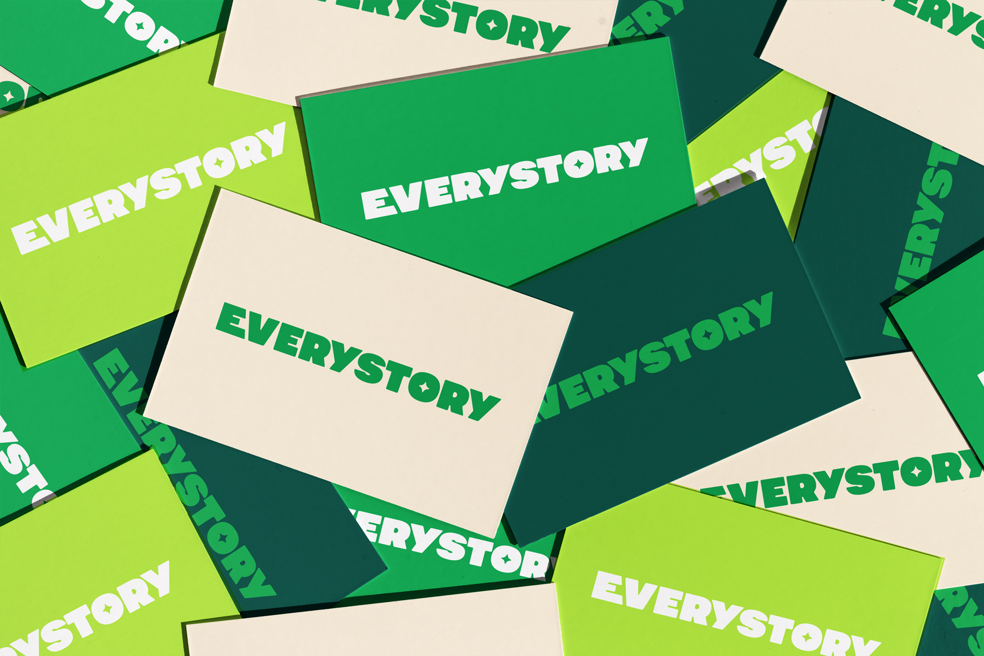
- A hidden star within the logo symbolising guidance, ambition, and self-direction
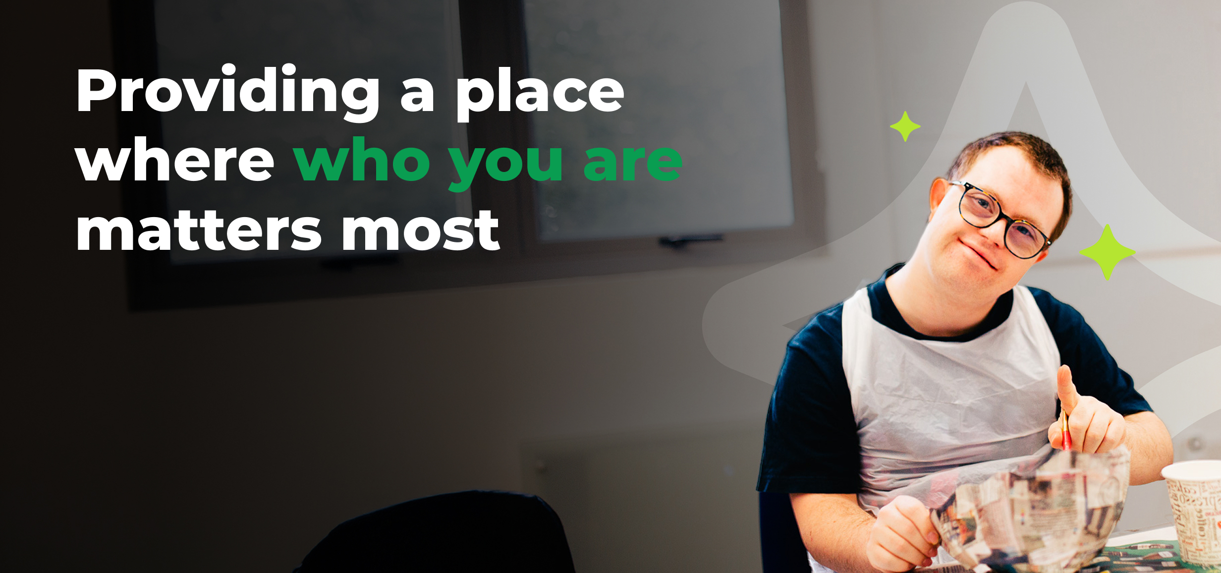
- A vibrant, uplifting colour palette that rejects stereotypes and celebrates real life
- A tone of voice that is brave, warm, and human, speaking with people rather than for them
At the core is a simple truth: EveryStory exists to help people take ownership of their story and pursue what matters most to them.
Delivery
We brought the brand to life across:
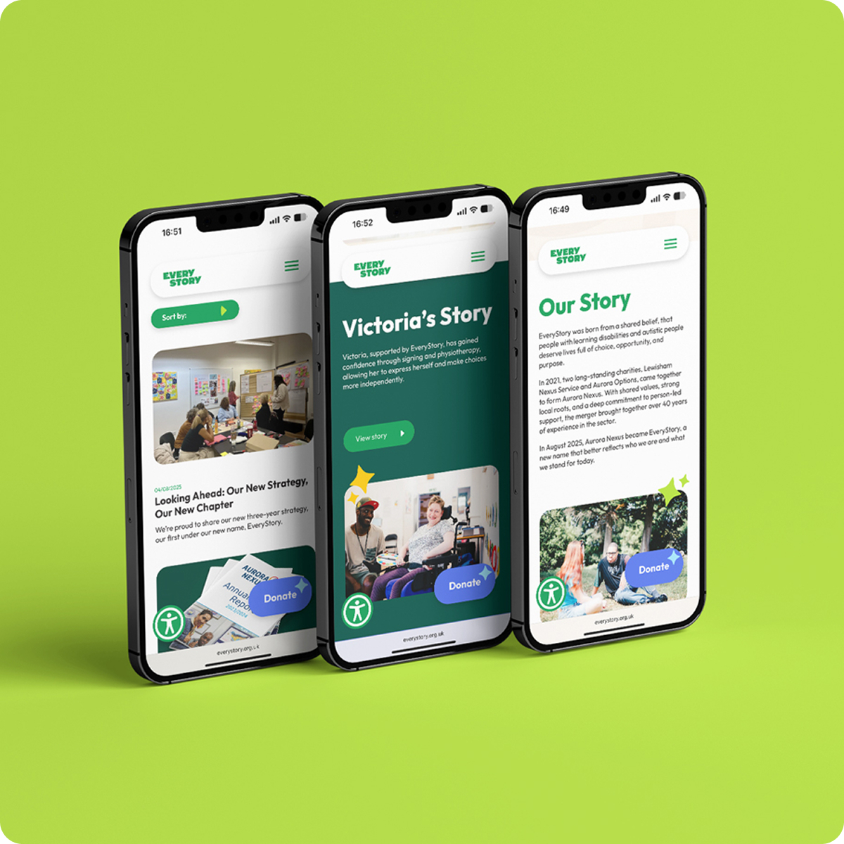
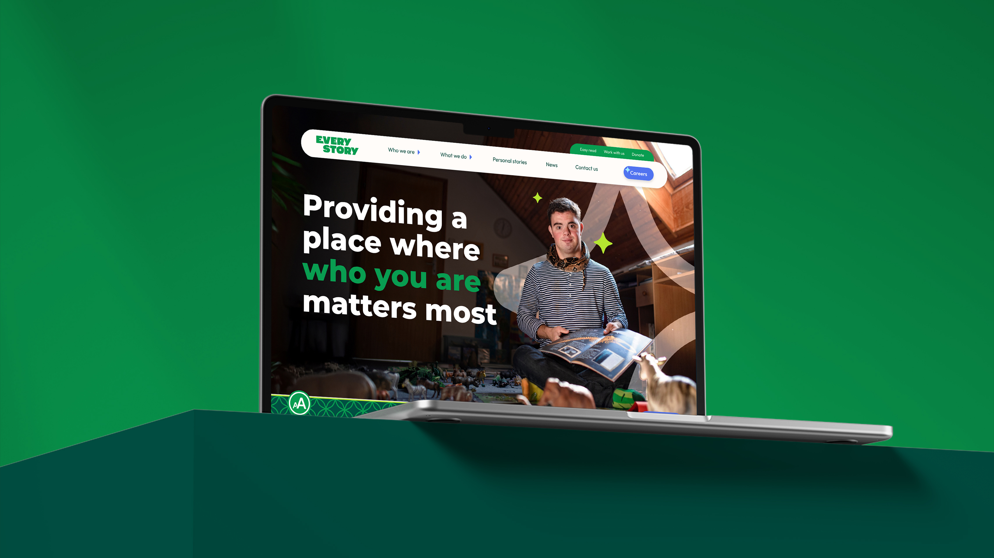
- Website
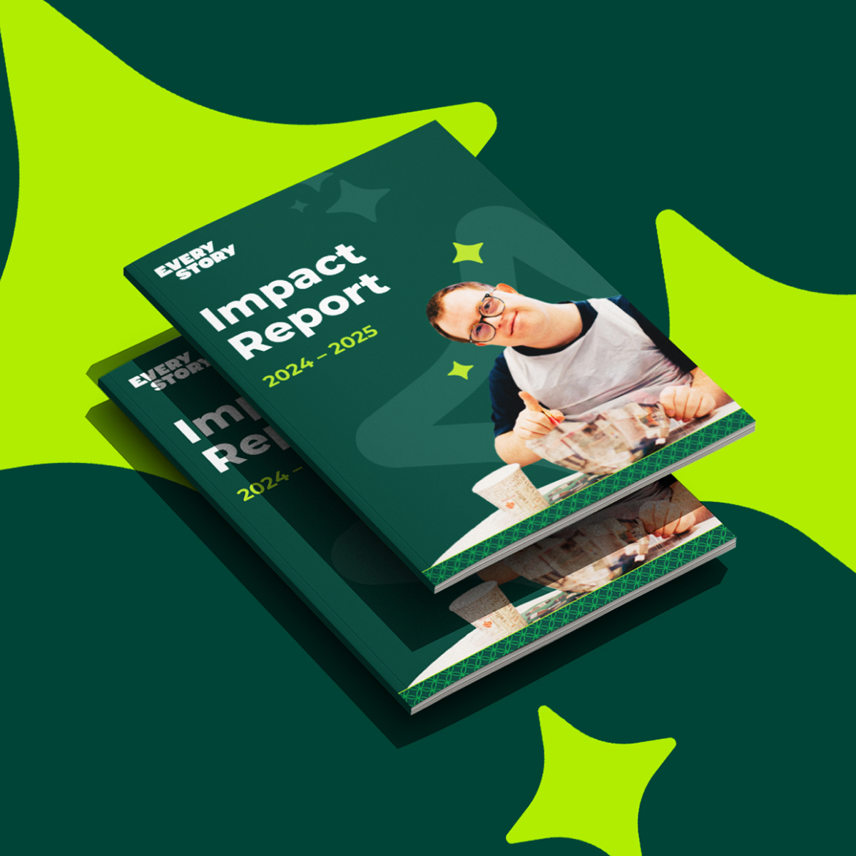
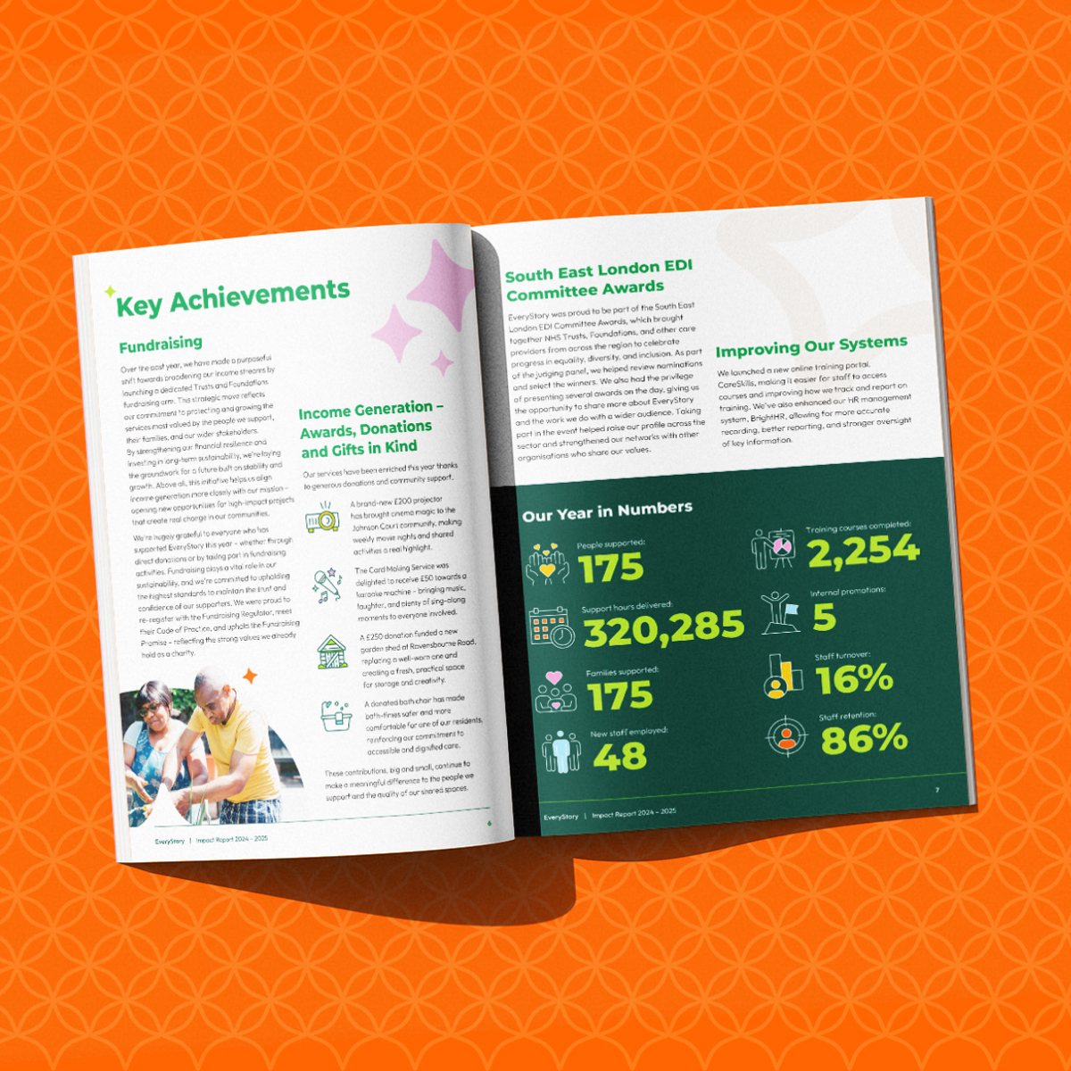
- Impact report
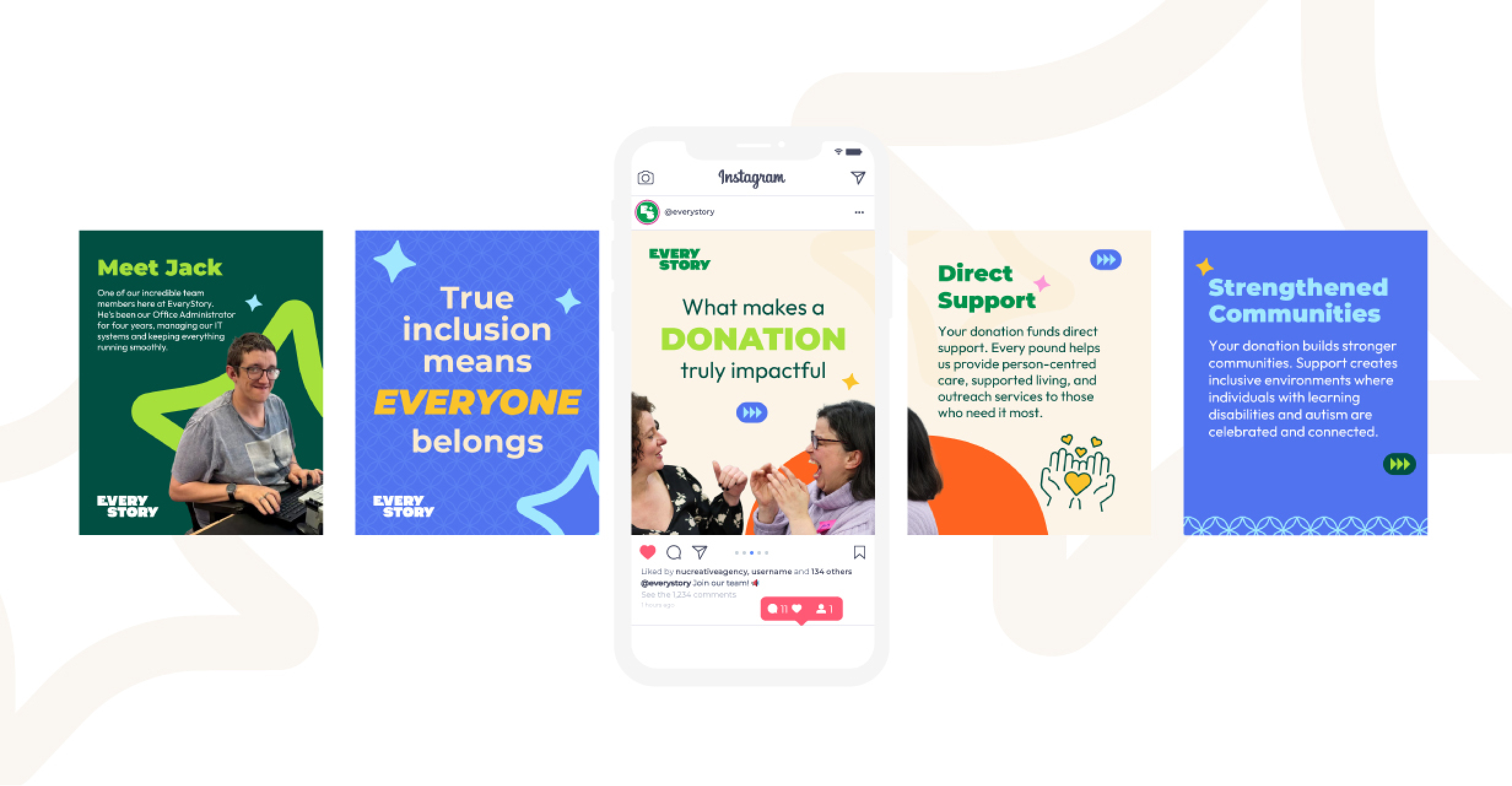
- Social media toolkit
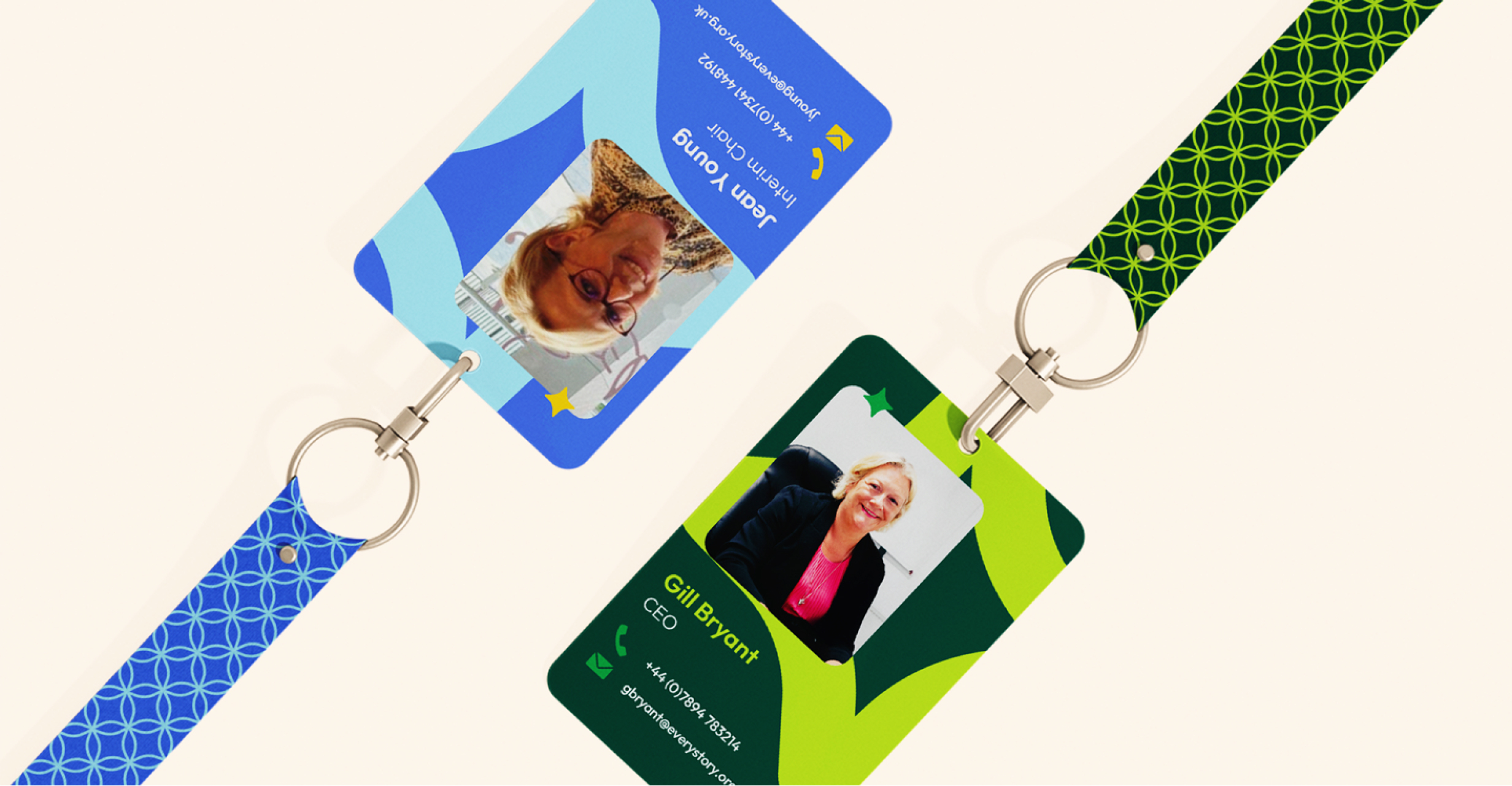
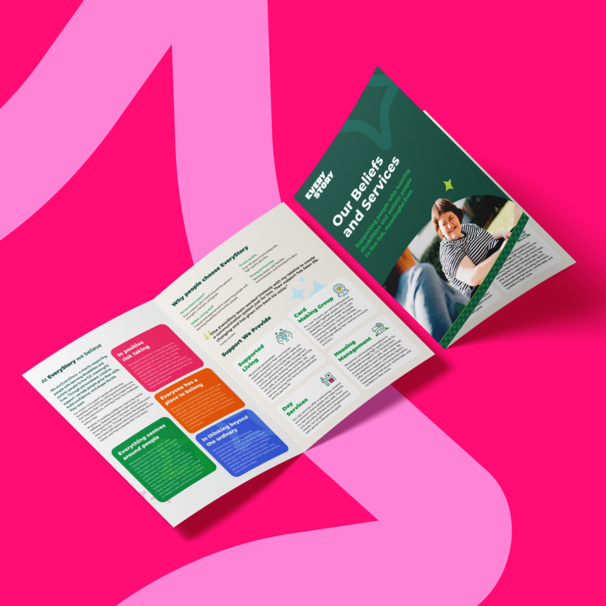
- Printed collateral and fundraising materials
- Internal brand guidance to unite culture and purpose
THE RESULTS
EveryStory now stands as a confident, modern charity, united under one shared mission, one inspiring name, and one compelling identity.
- A refreshed brand rooted in individuality and empowerment
- A united internal culture with a clear purpose to champion
- A memorable name and voice that communicates value instantly
- A visual identity that is bold, inclusive, and full of life
- A platform ready to increase awareness, funding, and impact
EveryStory is no longer just supporting people. It is enabling them to write the futures they deserve.
